Research one – Impact of technology and audience on Genre – crime
In school we learnt about the Macro Element Genre. Both Nick Lacey (Repertorie of Elements Theory) and Steve Neale (Genre Theory) agree that genres can change over time to keep the audience engaged. But a set of common conventions help the audience to relate to media this could include dark lighting for horror texts. Neale discusses that a combination of familiar elements and new unfamiliar conventions are what keep texts interesting. Here is my essay on how the genre of crime has changed over time due to socio-cultural influences, audience preferences and technological developments.
Research task two- Film opening conventions
They are lots of ways of different ways to recognize film openings by their typical conventions. These conventions allows the audience to associate film opening with main themes and genres creating a sense of comfort. This goes along with Steve Neal genres theory which suggests audiences want something they can recognize.
| Production logo and title | The production logo is implicated so people can recognize the branding as well as helping advertise that company so they could get a bigger audience. The title is chosen to show the themes with typography and the audience they are trying to appeal to. |
| Theme/topic | The theme allows the audience to understand the genre and give backstory to what the movie could be about. |
| Character introduction | Introductions engage the audience so they can start building connections to different characters. For example the movie Enola Holmes where she introduces herself captavating the viewers and creating a deeper bond with them. |
| Establishing the scene | This allows the producers to set the tone and genre of the movie hooking the audience and telling them what to expect. Like in the Adams family when the starting credits role through the whole town showing where the film will take place. |
| Foreshadowing | This is added to hook the audience and acquire their engagement so they will keep watching. For example in frozen when Hans displays that the castle will be his new home, the audience may want to find out how or why. |
Research task three- analysis of three different film openings
We analyzes three extracts which were film opening to look out for common conventions and how the audience gets hooked onto the movie/series. This is my film opening analysis sheet for my three movies that I studied.
Research Task 4- Inspiration for our coursework
- Home Alone 2 – Chris Columbus – 1992 – Comedy
- https://www.youtube.com/watch?v=7oZ5i_A067
- We decided to review this clip because it mirrored our scene of a rock being thrown at a window, this helps because it is useful to see a professionally made film with details of how they frame it and film the actors. This allows us to have a better understanding of how to convey emotions while keeping true to our scenes visions. As well as how they focus on only the window being broken which is a big part of our opening because it shows the start of the persons ‘cracked memories’ showing the basis of our movie. The clip also shows a kid throwing a rock at window which also shows how our movie is a flashback, so kid is throwing stones at a window.
- The Conjuring – James Wan – 2013 – Horror
- https://www.youtube.com/watch?v=JhMWopjJiI8
We analysed this clip to see the different micro elements used to create the atmosphere of a horror film, looking at specific elements with how lighting and sound is used to create tension and suspense for the audience within the scene. we also looked at how the producers create enigma to help us learn how to keep the audience in the dark during our scene, keeping the story mysterious elements, allowing us to let the audience figure things out themselves instead of simply telling them. - Moon knight- Mohammed Diab-2022- Phycological Thriller
- https://www.youtube.com/watch?v=ufvggK4YoQ4
This scene uses an editing technique to show the change of time; we are going to use this as inspiration for our flashback. We are using it because it impacts the audience through strong visual and sound. The sudden cuts to black and the sound cutting in and out helps the audience understand that something happened during the blackout, although we are going to use it to signify our flashback. Which creates meaning in our opening because the movie revolves around these flashbacks to create a sense of enigma and an eerie atmosphere.
Research Task 5- Production companies and logo research
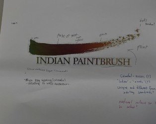
A well-known film company was called Indian Paintbrush. They were founded in 2006 it is most known for the grand Budapest hotel which has grossed $175million as well as most Wes Anderson films. They are owned by Steve rales who also owns 20% of the Indiana pacers. They key target audience are people in the age of 18-45 these are people who can appreciate distinct visual arts with odd and different storylines that captivates the audience.
Their static logo shows a vivid colorful paintbrush stroke, these colors could show the freedom and originality of the production company. The birds on the end add along to the theme because they are a symbol of freedom. Showing that the production company can do anything and produce all sorts of movies. The paint brush itself shows irregularity in the stroke which could show how it is not made by artificial intelligence and made by hand with care. When this logo is moving birds continue to fly away emphasizing the freedom and creativity of the production company. The zoom out of the logo is then accompanied by a musical tune making the logo more recognizable. The intentions of this logo is the transformation of a small blurry piece of artwork to a full clear logo like what happens in a movie.
Indian Paintbrush helped us brain ideas about our own product we liked the idea of having a clean moving entrance. We wanted to do that with our logo so we thought the window within our A could open into the scene moving and having a flow to starts the film. Unfortunately with our limited time and editing skills this could not be achieved but we still kept the idea of a window. Since Indian paintbrush usually just fades away into the movie we decided to choose a black background for a nice and easy fade in and out within out movie.
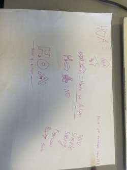
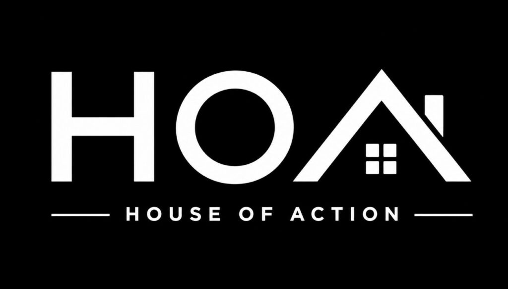
Above is our finished logo, this represents our group with the letters standing for each founder. There was an idea to create the window into a door that opens to the start of a film but that was shut down when are editing skill where only basic. But this bold simple design of the logo is supposed to stand out and emphasize how the company has a clean and sheik finish. The name house of action comes from how directors say action before every scene which ties nicely into our own company that produces and edits movies. The black background allows for a simple edit of a fade out/in which can go along with most movies that are produced
This Logo was designed by Alistair Rogers aka Me