Logos for film companies and the reasoning for them.
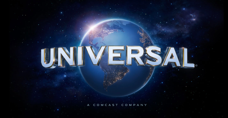
Universal studios
This logo has impressive quality and 3d imagery this is to show of the budget of the film and their standard, also this logo shows the whole world in it potentially being a metaphor for the size of the company.
JCANNA productions
This logo is kept simple and has simple gradients with colours that are easy on the eyes, this in combination with the font of the logo is used to portray professionalism. Also, JCANNA is a combination of all three directors’ names Joshua, Cody and Anna.
Generas
conventions
twists and turns
equilibrium and disequilibrium
metal dilemmas
confusion on Right and Wrong
Drama
Conventions
relation ship
setbacks
challenges
strong character arc
emotional
Final Film opening production:
Timeline (done by Josh)
RAMs sheet (Josh and Anna)
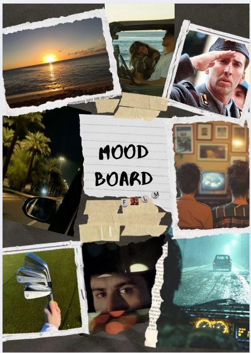
Mood board (done by Anna)
Script [Cody, Josh]
Story Board (Cody)
Responses For My Rough Cut.
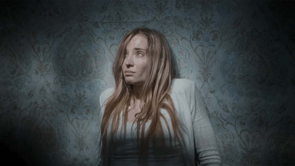
Most people like the narrative of the film however they did not like the sound editing and how there was not enough tension between the EX and Beatrice. The majority of the responses said the genera seems to be a Thriller/drama which is what we aimed for. (This was for the rough cut)
In summary:
- good
- plot seems intresting
- acting
- shows a good connection between couple
- bad
- sound
- clarity
- need to make the connection between Cody and Beatrice more clear
- need to make Cody more obvious that she is in the house