Analysis of “I’m Not a Robot“/ “Ik Ben geen Robot”
Key Information
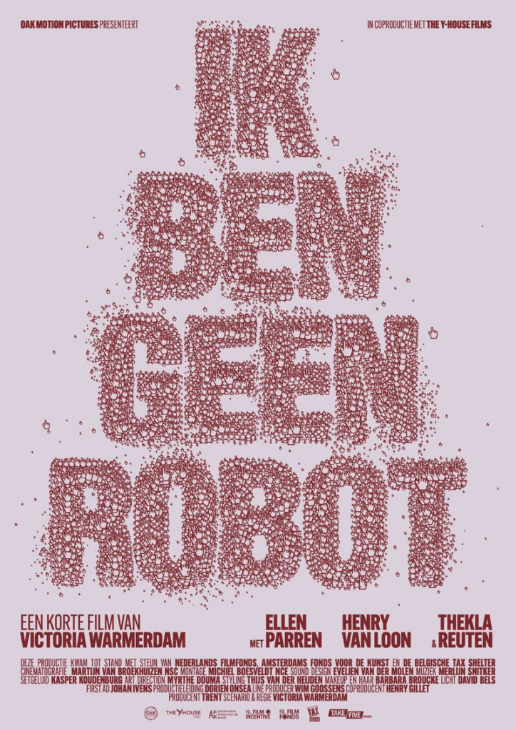
Title: I’m Not a Robot
Year of release: 23 September 2023
Director(s):Victoria Warmerdam
Production Company/label: OAK Motion Pictures, The Y-House, Bulletproof Cupid
Genre: Science fiction drama
Target audience: Young adults and fans of really conceptual films.
Narrative structure
The narrative structure follows Todorov’s narrative theory, with the equilibrium being that we are introduced to Lara at her job, where she seems to be just an ordinary office worker. She is disrupted by CAPTCHA tests for an update on her music app, telling her there is an 83 per cent chance that she might be a bot. Lara slowly became obsessed with the idea that she might be a robot, determined to prove the customer service person she called wrong. The film slowly reveals personal details about her life, making her question reality.
Themes and messages
The short film explores social themes, such as the inequality between men and women, especially evident in Lara’s treatment and the dismissal of her feelings. Furthermore, Lara’s existence in this film is controlled by others and by portraying a woman in the role of a “Robot”, it feeds into the stereotype that men control women in our society.
Character Types
Lara – The main protagonist
The short film follows her perspective and emotional journey; the audience sympathises with Lara more because the film uses a retrospective narrative, meaning we only know what she knows, which creates tension and confusion alongside her actions. Her character is also contradicts what the media presents AI as; a lot of media shows AI as a robot with no thought process to itself, along with no emotional depth, but that is not the case with Lara because she shows empathy, fear and vulnerability to her situation.
The boyfriend – The controller
Lara’s boyfriend functions as a controlling role who knows ‘knowledge’ that Lara does not have; his calm reaction to Lara finding out that she is a robot contrasts greatly with Lara’s emotional distress, which can raise questions about trust and gender imbalance within a relationship. This can also connect him to patriarchal authority because he partially controls Lara’s identity and understanding of herself.
Visual style
The short film follows a cold and muted colour palette, such as grey, white and pale blues, which creates an artificial atmosphere, reinforcing the sci-fi theme of the film. The spaces where the scenes were shot are modern and uncluttered, with the setting often looking highly organised and almost unnatural, which feeds into the plot of the film.
Camera techniques
Close-up shots are also frequently used to capture Lara’s emotions, while lots of wide and establishing shots are used to set the scene of the office. There are a lot of smooth camera shots where we follow Lara’s movement in the film, making the story feel continuous as well as building suspense for the audience successfully.
Sound techniques and Editing
Sound and editing also play a significant role in shaping the audience’s understanding. The dialogue of all the characters feels very clear and natural, as if we are watching it play out in real life; however, the dialogue is in Dutch, which can reinforce the vibes of Eastern European countries to the audience since our generation has the perspective that European countries have a cold, looking feeling to the infrastructure and overall atmosphere. The subtle background music can also enhance emotional moments and increase tension when necessary. Furthermore, the editing style is smooth, maintaining a steady pace as it builds toward the climax.
Research Task 3
Analysis of “Au revoir mon monde”
Key Information
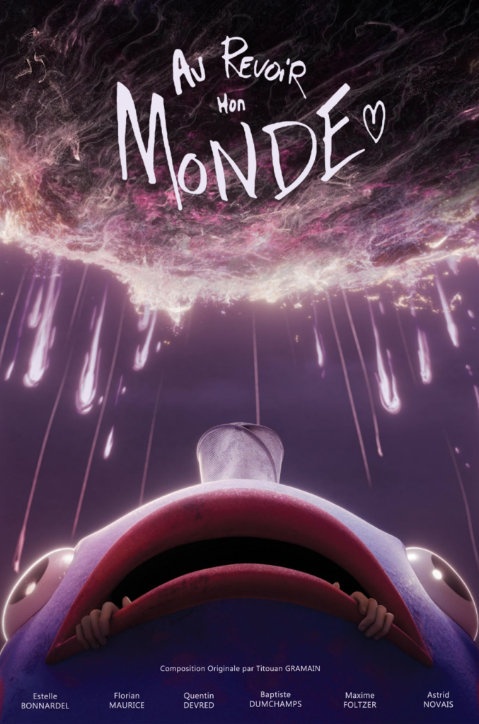
Title: Au revoir mon monde
Year of release: 9th of November 2023
Director(s): Estelle Bonnardel, Quentin Devred, Baptiste Duchamps, Maxime Foltzer, Florian Maurice, and Astrid Novais
Production Company/label: Ecole MoPA
Genre: Science Fiction drama
Target audience: Teenagers and young adults, particularly fans of animation and anime-inspired visuals.
Narrative structure
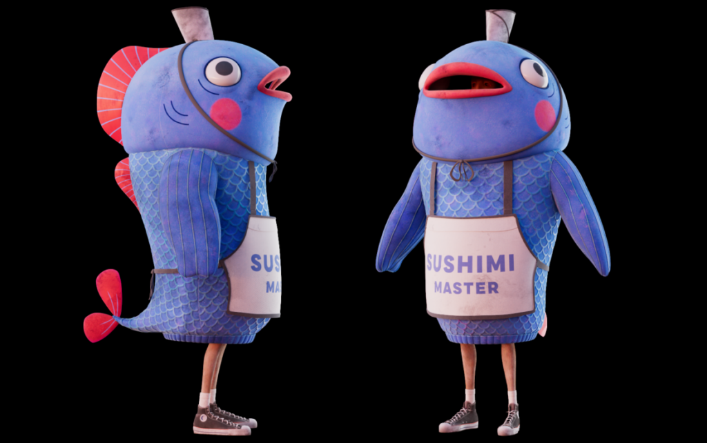
Au Revoir Mon Monde follows a linear narrative structure that can be explained using Todorov’s Narrative Theory. The story begins with an equilibrium where Karim is living an ordinary life, working at a sushi shop while wearing a fish costume to promote the restaurant. This normality is disrupted when a meteor lands in the city and destroys half of the city, slowly spreading fire to the sushi restaurant where he works. Our protagonist sees the danger around him as he decides to spend the rest of his time with the person he loves. The majority of the short film focuses on his journey through various obstacles in the city and his race against time. At the end, Karim reaches his loved one and confesses his feelings before the apocalypse, solving the conflict and creating a new equilibrium.
Themes and messages
The themes and messages conveyed through this animated short film are love and the importance of living in the present. At the very last moment of Karim’s existence on earth, he realises that emotions matter more than everyday routines or material possessions. The film shows the audience that life is unpredictable; you can never know what will happen tomorrow, and people should express their feelings before it is too late. The obstacles Karim faces in his journey might be a metaphor for the difficulties in life, reminding the audience to show resilience.
Karim – The protagonist
The story follows him on his journey and personal goal of reaching the person he loves before the world ends. Karim could also fit into the hero stereotype, as he faces dangers while crossing nearly the entire city to find his love interest, providing emotional motivation for his actions.
Au Revoir Mon Monde uses non-diegetic sounds to create emotion and build tension throughout Karim’s journey. The soundtrack becomes more intense during action sequences and then slowly transitions to softer music in emotional moments. Sound effects of explosions and meteor impacts were added in post-production to enhance the apocalyptic atmosphere, immersing the audience completely. The editing, however, is very fast-paced to keep up with the 5-minute timeframe, but personally, I felt that the editing was even faster when the action scenes were used to create a sense of urgency, which could be a reflection of the limited time Karim has. The style completely changed when Karim reached his loved one at a much slower pace, resulting in the audience focusing on the characters’ feelings and relationship.
Based in a vibrant urban city that is gradually being destroyed by meteors. The city streets, buildings, and restaurants are what the audience would usually see out in the street, which can create a realistic vibe, but the bright colours could feel unsettling, as well as the apocalyptic events. The most significant mise-en-scene that stood out to me is the neon lights and detailed background of each frame, which could establish an energetic atmosphere in contradiction to the disaster around him. Another interesting mise-en-scene is the character costumes, such as Karim’s fish mascot outfit, make him distinctive and add personality to the story.
Personal Reflection
Watching Au Revoir Mon Monde will help me with my own short film project because it shows clearly how important visual storytelling can be to convey different emotions to the audience. I found that the colour palette of the film has helped tone down the despair that is happening in the film, which I will utilise since my short film will explore a lot of societal problems and having bright colours will tone down the gloominess. The animation of character expressions to communicate emotions with very little dialogue has also influenced me greatly; however, in my short film, I would prefer it to have more exaggerated expressions. Au Revoir Mon Monde also matches the length of how long my short film will be, so I could use it as a blueprint for scenes, making sure my project fits into the time frame.
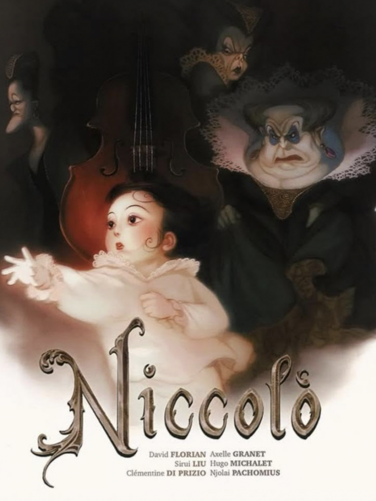
Analysis of “Niccolò”
Title: Niccolò
Year of release: 9th of October 2025
Director(s): Clémentine Di Prizio, David Florian, Axelle Granet, Sirui Liu, Hugo Michalet, and Pachiomius Njolai
Production Company/label: Miyu Productions
Genre: Animated Fantasy Drama
Target audience: Teenagers and adults who enjoy artistic and thought-provoking animated films.
Narrative structure
NICCOLÒ follows a clear linear narrative structure, with the start being a rise leading to a climax, then a resolution. The story begins with the introduction of Niccolo, a talented violinist whose success and fame grow as he receives increasing admiration from his audiences, and whose desire to be seen grows stronger. This leads to him being trapped by the expectations of those who praise him, losing his sense of self. The climax of the story occurs when his violin breaks, forcing him to confront the consequences of his obsession with fame. Lastly, in the story’s resolution, Niccolo chooses artistic freedom over applause, rejecting the pressures placed on him and reclaiming his identity as a musician.
Themes and messages
The short film NICCOLO focuses on the challenges of identity as well as the pressure that comes along with fame. Throughout the film, Niccolo becomes consumed by the desire for recognition, leading lose sight of his passion for music. The message of the film is that seeking constant approval from others can be bad for your mental self and that fulfilment comes from staying true to yourself. Through its dark fantasy imagery inspired by 90s anime and symbolic characters, the film also explores the struggle between innocence and corruption, showing how expectations placed upon you can slowly make you lose your sense of self.
At the centre of the story is Niccolo, who is a talented young violinist whose desire for fame and recognition drives the narrative. He is also a very good example of the hero stereotype, as he faces challenges and pressures that threaten his identity.
Visual style and Camera techniques
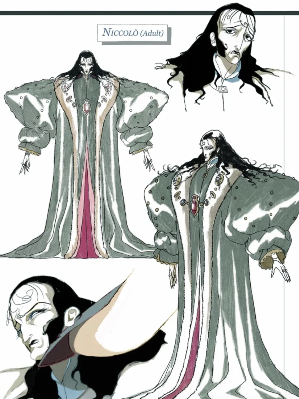
NICCOLO features a visual style inspired by 1990s anime and Visual kei, a Japanese fashion and music movement known for its dramatic aesthetics and theatrical performances. The main character, Niccolo, is a direct reflection of these styles in his hairstyle, clothing choices, and makeup. To be specific, his style is inspired by Tanbi Kei. The film combines these elements with a dark fantasy atmosphere, detailed backgrounds, and strong contrasts between light and shadow. In emotional scenes, lots of close-ups were used to translate his emotions to the audience, while wide shots were used to show the beautiful architecture in the animation, setting the overall tone.
Sound techniques and Editing
The soundtrack of the film is heavily focused on the violin, which reflects Niccolo’s passion for music and his connection to his art. There are also lots of ups and downs in the music style, helping to convey the shift in emotions, since there are no dialogues included in the film. In terms of editing, smooth transitions were used to help maintain the flow of the narrative, while faster cut scenes were used during dramatic moments to increase tension.
Locations, mise-en-scene, and personal reflection
The short film is set in a dark, gothic-inspired world that acts as a metaphor for the protagonist’s emotional journey. The animation backgrounds are filled with grand architecture and theatrical performance spaces, creating a mysterious atmosphere. There is a lot of mise-en-scene used, which I will be focusing on the most significant ones, symbolic props such as the violin, which represents Niccolo’s connection with his identity, as well as the costume design, playing a big part in the film, reinforcing the tone, Niccolo’s Visual Kei-inspired appearance helping him stand out. This film has been a useful source of inspiration for my own short film project. I was particularly interested in how the film uses a distinctive art style and symbolic imagery to communicate emotions and themes without relying heavily on dialogue. Which I will take note of when creating my whole animated short film.
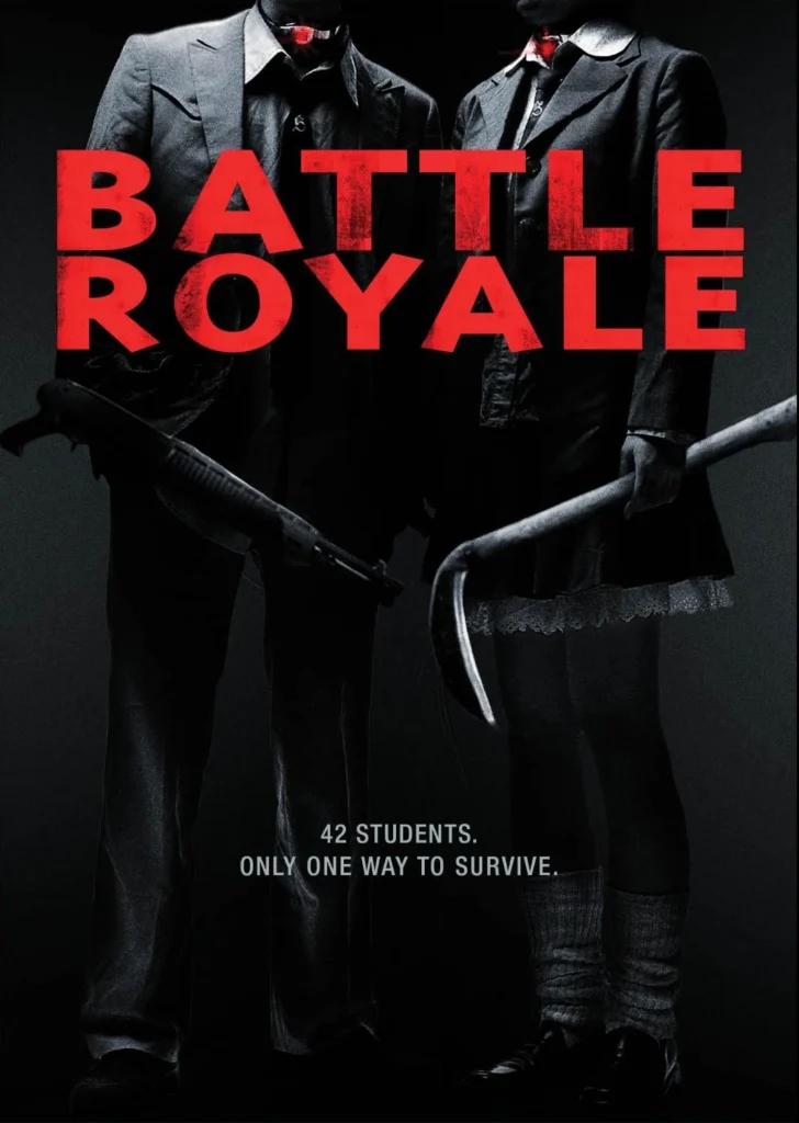
Analysis of “Battle Royale”
Title: Battle Royale
Year of release: December 16, 2000
Director: Kinji Fukasaku
Production Company/label: Battle Royale Production Committee
Genre: Psychological Thriller
Target audience: Older teenagers who enjoy dystopian themes. The movie is very mature, so it is more suitable for an older audience.
Narrative structure
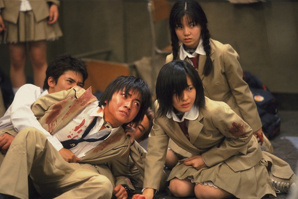
Battle Royale uses a linear narrative structure that follows a class of students under a government with absolute control. The story’s equilibrium is disrupted when the students are taken to an island and forced to participate in a deadly survival competition where they just fight each other until one survivor remains. As the film progresses, tensions rise when friends betray each other, and students struggle. The climax occurs during the final confrontations between the three remaining contestants, Shuya Nanahara, Noriko Nakagawa, and Shogo Kawada. They devised a plan to trick the government that was watching the games, and only Kawada survived, leading to a resolution in which the other two characters escaped the island.
Themes and Messages
The film explores themes of government control and human nature. Every message from the film is a critique of an authoritarian government that uses fear and violence to maintain control over people, forcing students into a deadly competition. It examines how extreme circumstances can reveal both the best and worst parts of human nature. Furthermore, it highlights the importance of resisting oppression, suggesting that humanity can survive even in the environment depicted in the film.
Hero/protagonist – Shuya Nanahara, who tries to survive while protecting others and trying to figure out a way for everyone to survive through the game
Heroine – Noriko Nakagawa, who represents hope and is also Nanahara’s love interest.
Mentor – Shogo Kawada, an experienced survivor from a past game where he won, joined the class as a transfer student to guide the main characters, helping them escape the island
Antagonist – Kitano, the teacher controlling the Battle Royale program
Villains – Students such as Kazuo Kiriyama and Mitsuko Souma, who use manipulation to survive and use violence without thinking twice; however, Souma was given a backstory on why she turned out the way she is. She was brought up in a household with a deadbeat mother, and her stepdad always tried to make advances on her.
Teenagers and young adults who enjoy emotional, character-driven films, particularly audiences interested in animation and independent short films.
Feature
Analysis
Types of posts
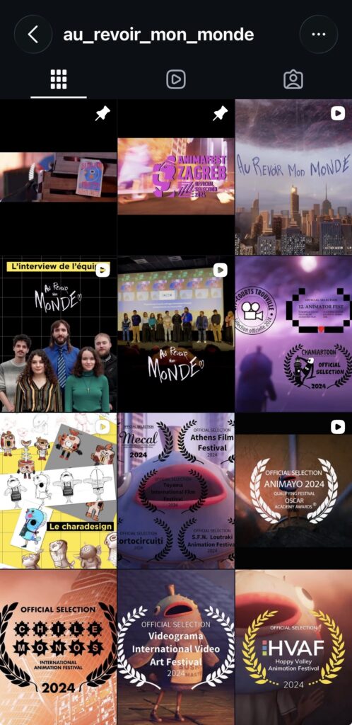
Character designs, trailers, production updates, background designs, awards the film has won, interviews with the animators, and the full short film.
Posting frequency
The account posts relatively steadily, with updates about the short film appearing almost every month.
Main purpose of posts
The main purpose is to promote the film to a wider audience. As Au Revoir Mon Monde is an independent film, Instagram provides a free platform to increase its visibility and reach potential audiences.
Most popular post & why
The most popular post appears to be the full short film uploaded to Instagram. I judged this based on its number of reposts (19), as the account has hidden its like counts. The full film is likely more shareable because audiences can directly watch and recommend it to others.
Feature
Analysis
How does it attract attention?
I feel that the account does not attract a particularly large amount of attention when considering the number of awards the film has won compared with its relatively small follower count. The content can also feel repetitive, as approximately 50% of the posts focus on awards the film has received.
Hashtags
Hashtags are mainly used on posts containing the full animation. These hashtags are primarily related to animation, helping the film reach audiences interested in animated content.
Use of trends
There is little to no use of current Instagram trends. The account focuses almost entirely on content directly related to the film.
Building excitement/anticipation
The account created some anticipation when it first started by posting trailers and production-process content. However, this became less prominent later, meaning there is limited ongoing anticipation for new audiences.
Feature
Analysis
How does it interact with the audience?
The creators interact with the audience relatively frequently, particularly by liking comments left on their posts.
Is the audience encouraged to like/share/comment?
There are no obvious calls to action encouraging audiences to like, share or comment on the posts.
Audience responses
Audience responses are generally positive. Comments include fire emojis and people describing the animation/film as very good.
Conventions
Feature
Analysis
Visuals: colours, fonts, logo and style
The posts use very colourful imagery that matches the visual style of the animation. However, the repeated use of similar colours and imagery can become repetitive and potentially reveal too much about the film, which could reduce the audience’s curiosity to watch it. The font remains consistent across the account, although its size varies between posts, creating some visual variety. The logo also remains consistent and fits the square format of Instagram posts effectively.
Consistent theme/branding
The account has strong and consistent branding. Rather than creating completely separate promotional content, it mainly uses snippets, screenshots and images taken directly from the short film. This creates a clear connection between the Instagram page and the film itself.
Links, release dates and calls to action
The account does not make significant use of release dates or calls to action. This limits the ways in which audiences are directly encouraged to engage further with the film.
Feature
Analysis
Does it connect to other media?
Yes. The Instagram account connects the film with the creators’ own social-media accounts.
What other media/platforms does it link to and why?
The creators’ accounts are linked in the Instagram biography. This makes it easier for audiences who are interested in the film to discover the directors/animators and explore their other work. This demonstrates media convergence, as the film’s promotional platform connects audiences to other digital media associated with its creators.
Teens and young adults, especially audiences around the age of 14 who are interested in emotional and character-driven indie films.
Content & Posts
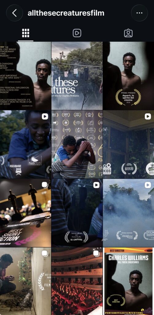
Types of posts: Snippets of films, trailer, short clips, the awards they have been given and the festival achievements.
Posting frequency: They were posting very frequent when the short film came out (World premiere: 18 May 2018 at the Cannes Film Festival in France) But they stopped posting after 2020
The main purpose their posts: Gain more attention from all types of audience because they are using a wide spread media platform.
Most popular post & why: Their most popular film is a post celebrating screening over 150 film festivals and across 50 countries.
Promotional strategies
How does it attract attention: They didn’t attract much attention on instagram because they have a relatively small amount of followers and likes compared with the film’s wider industry recognition. However they mainly attract attention through its recognition at film festivals.
Hashtags? What kind?: They used a consistent hashtag throughout their posts using #shortfilm as well as #film festival.
Use of trends?: There were no use of trends
How is it building excitement/anticipation: They did build excitement through posting of the production process and trailers when the account just started, but that is all they did with building anticipation for the audience.
Audience engagement
How does it interact with the audience: The account builds anticipation mainly through teasers and film stills, which give a glimpse of the film without revealing the narrative of the film unless you watch it.
Is the audience encouraged to like/share/comment: No there are no encourages for the audience to like/share/comment.
What kind of responses does the audience give: There are barely any comments from the audience but if there is it is usually congrating the film makers on their achievements.
Conventions
Visuals used – colours/fonts, logo, style: The Instagram account uses cinematic stills from the film to communicate its emotional atmosphere. The visuals have a natural and muted colour palette, which gives off a realistic style. The font of the film title are kept simple allowing the main image to be the focus.
Consistent theme/branding: The account have a very consistent cinematic visual style from it’s imagery taken from the film, keeping the same emotional tone throughout the page.
Does it include links, release dates, and calls to action: No
Convergence
How does it connect to other media? Yes, it is linked to the accounts of the creators in the page’s bio.
What other media/platforms does it link to, and why: It links to the different accounts of the film directors in the page’s bio because it would be easier for the audience to find them.
Postcard Advertisement Research and Planning
I decided to plan my reaserach around two movie posters because they are not many short film post card advertisements I can research on.
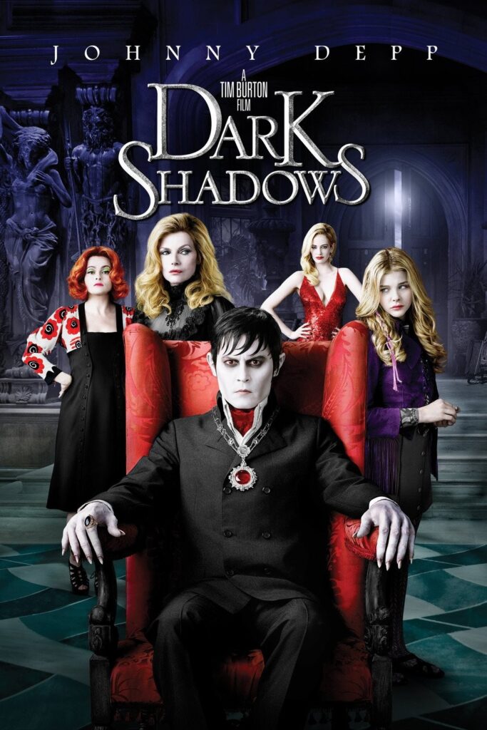
Dark Shadows — Tim Burton
Type of Media: Movie Poster
Genre: Comedy / fantasy with gothic elements.
I am using Dark Shadows as a film-poster example rather than a postcard advertisement. I chose it because the visual conventions are relevant to my own short film, Limbo, particularly its use of dark colours character focused composition.
Information included and purpose
The films title covers a large space in the poster, the name of major film star and the director, there are many versions of the posters for Dark Shadows although this in this poster I had put above don’t have a tagline but in other posters it is either “Every family has a Demon.” or “Strange is relative.” These elements combined can quickly give the audience infomation about the tone and who is stared in the movie.
Main imagery
The main characters are placed in the centre of the movie, with Barnabas Collins positioned in the foreground. This composition can suggest to the audience that this film is very character driven and the gothic styled background sets an mysterious tone to the poster.
Character representation
Barnabas is presented with pale skin, dark clothing and a dark smokey eye suggesting his vampire background furthermore the characters are placed closly standing next to him, creating the impression of a family.
Colour
The poster uses dark blue, black and grey background but they contrast with the red and purples of the characters costumes. This creates a gothic atmosphere while the brighter colours prevent the poster from looking visually flat.
Typography
The lettering is very visable as it is very big and has an old-fashioned apperance, which reinforces the historical and supernatural setting. Also the title is larger conpared to the other type so it very obvious that this is the title when a audience is looking at it.
Branding
The poster promotes the Tim Burton identity through the wording “A Tim Burton Film” as well as the gothic style that is wildly associated with all of his work. They also used Depp’s star status as part of the branding as well.
The conventions I want to take from Dark shadows is how the characters are placed, since my short film “Limbo” is also very character driven, so placing them in the frame of my postcard advertisement is very useful as the audience and know the characters before they watch my film.